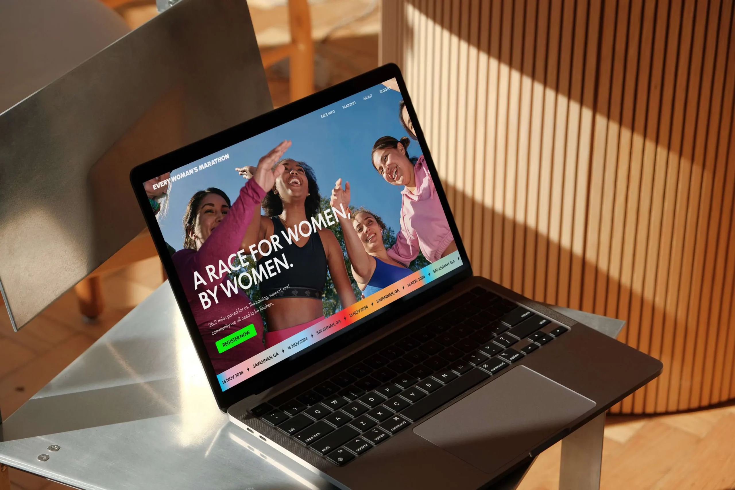
Every Woman's Marathon
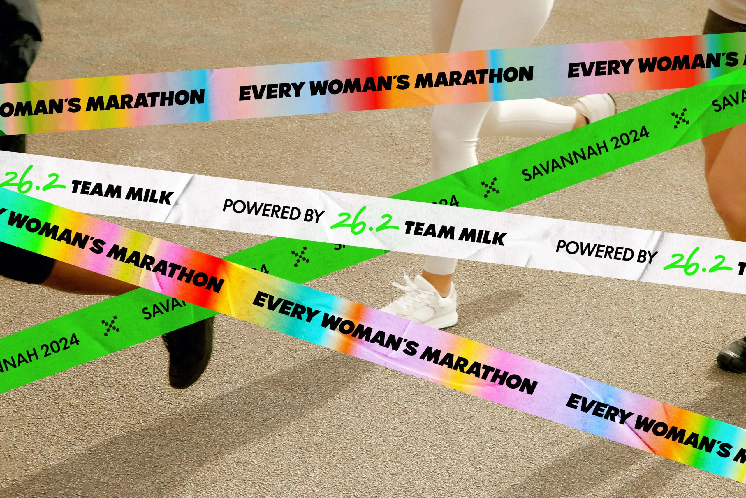
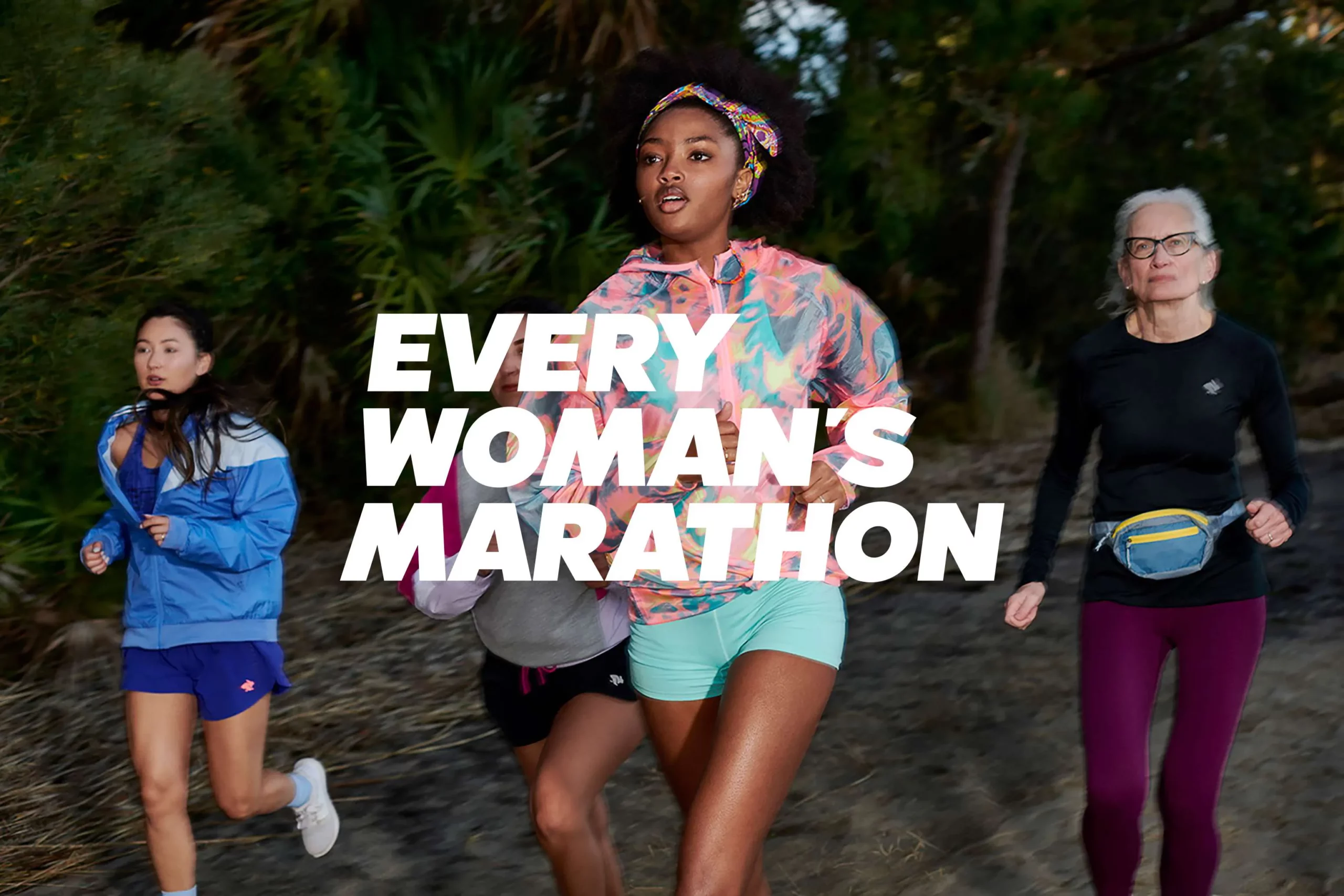
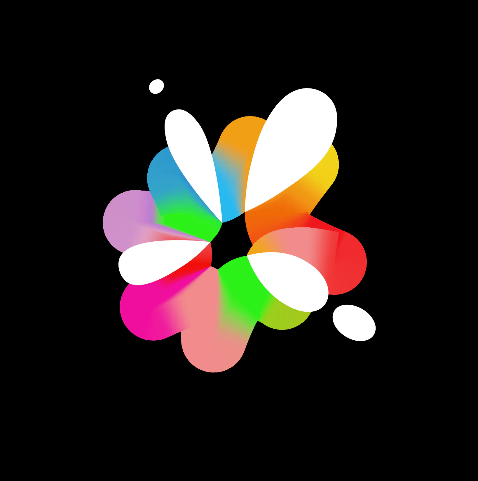
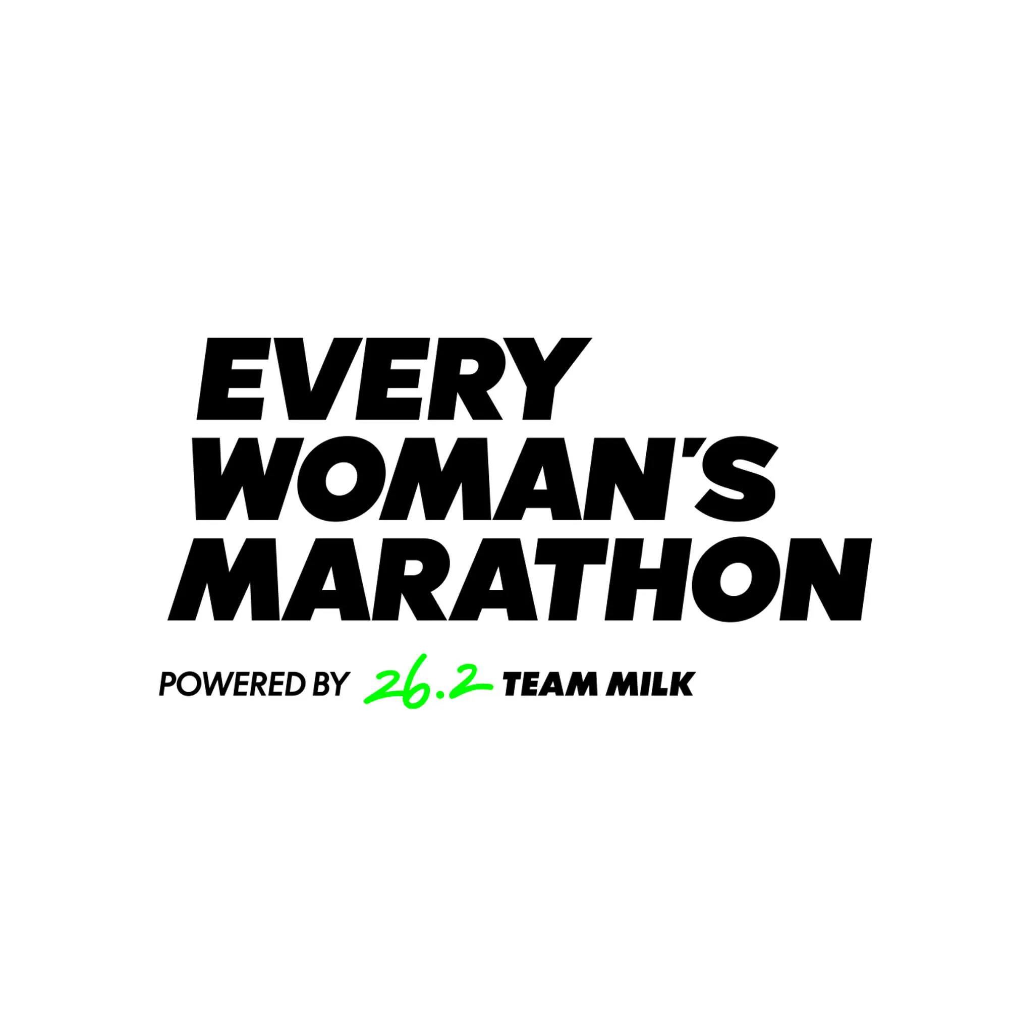
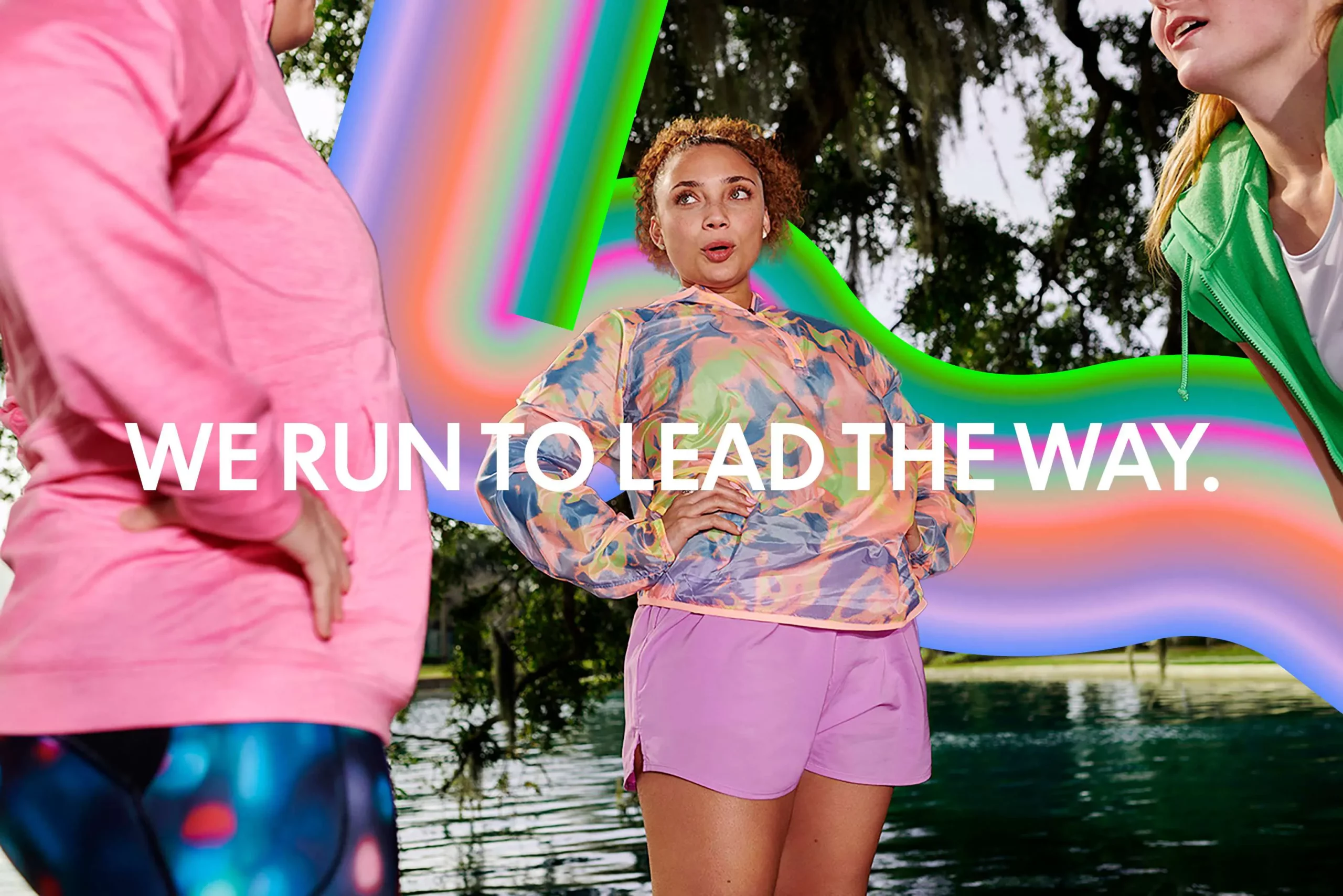
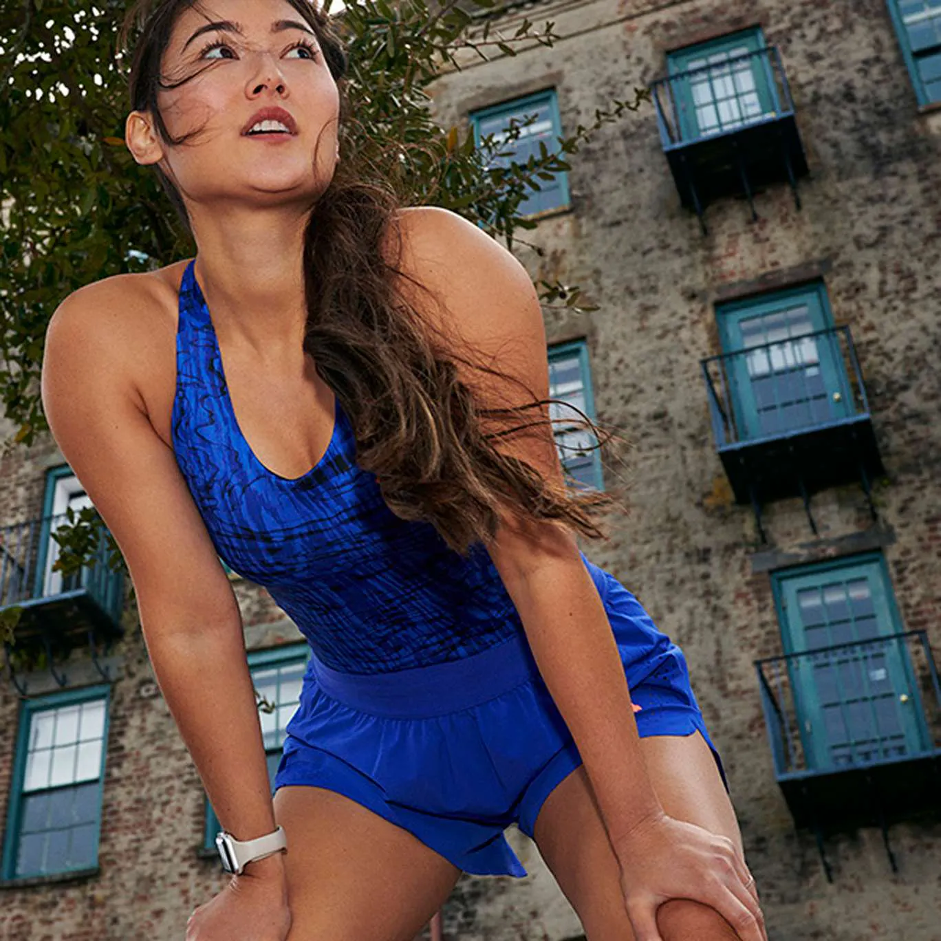
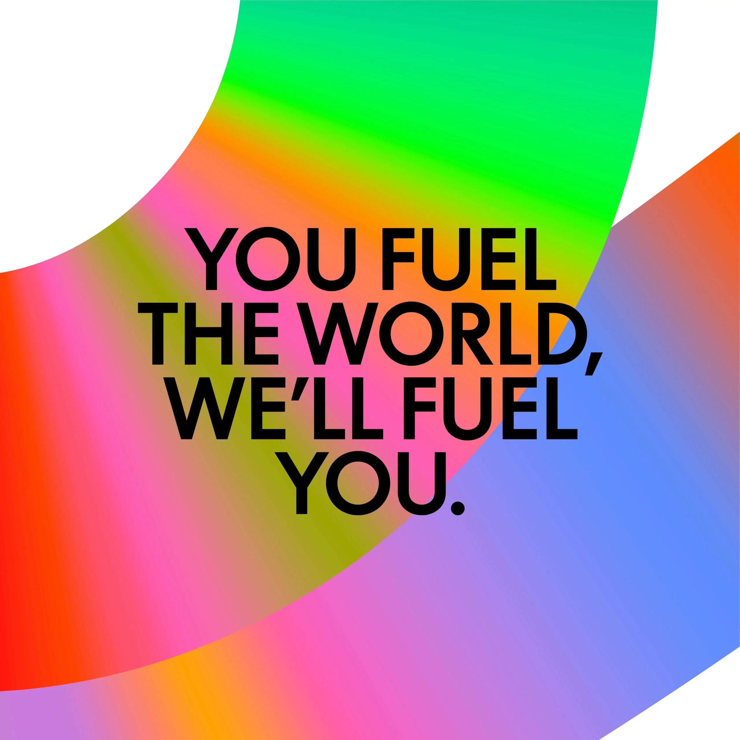
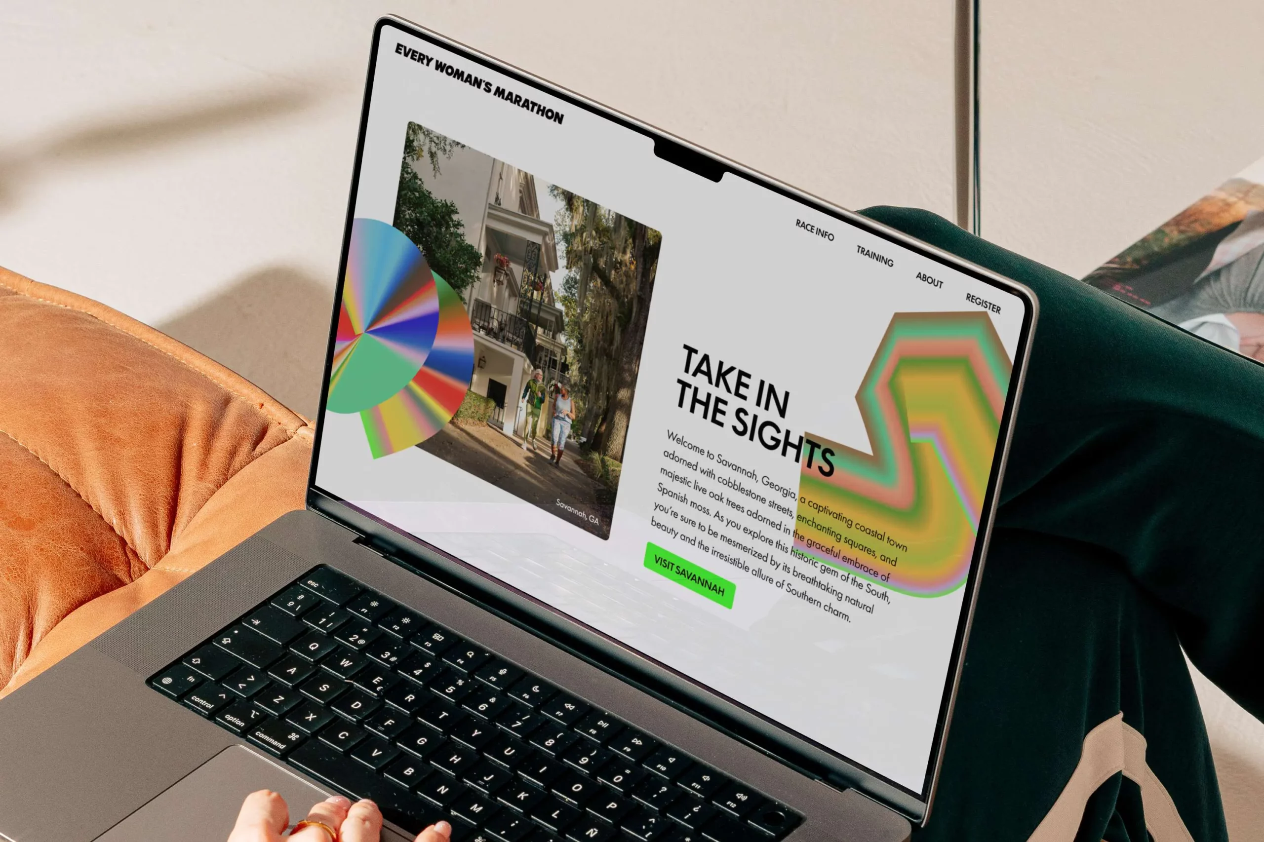
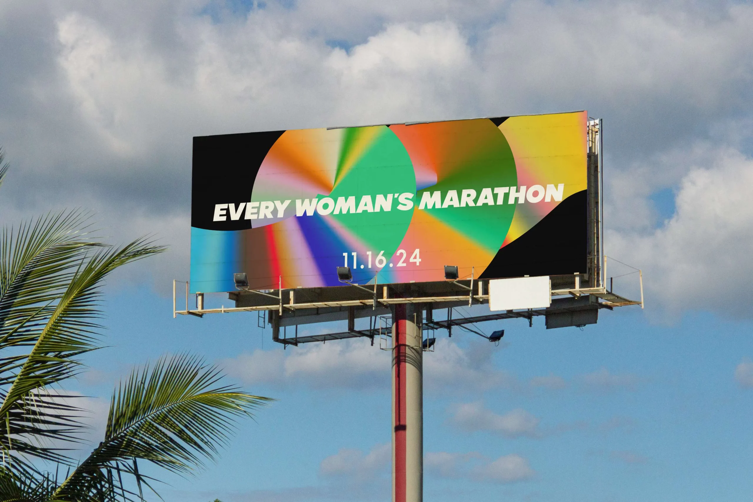
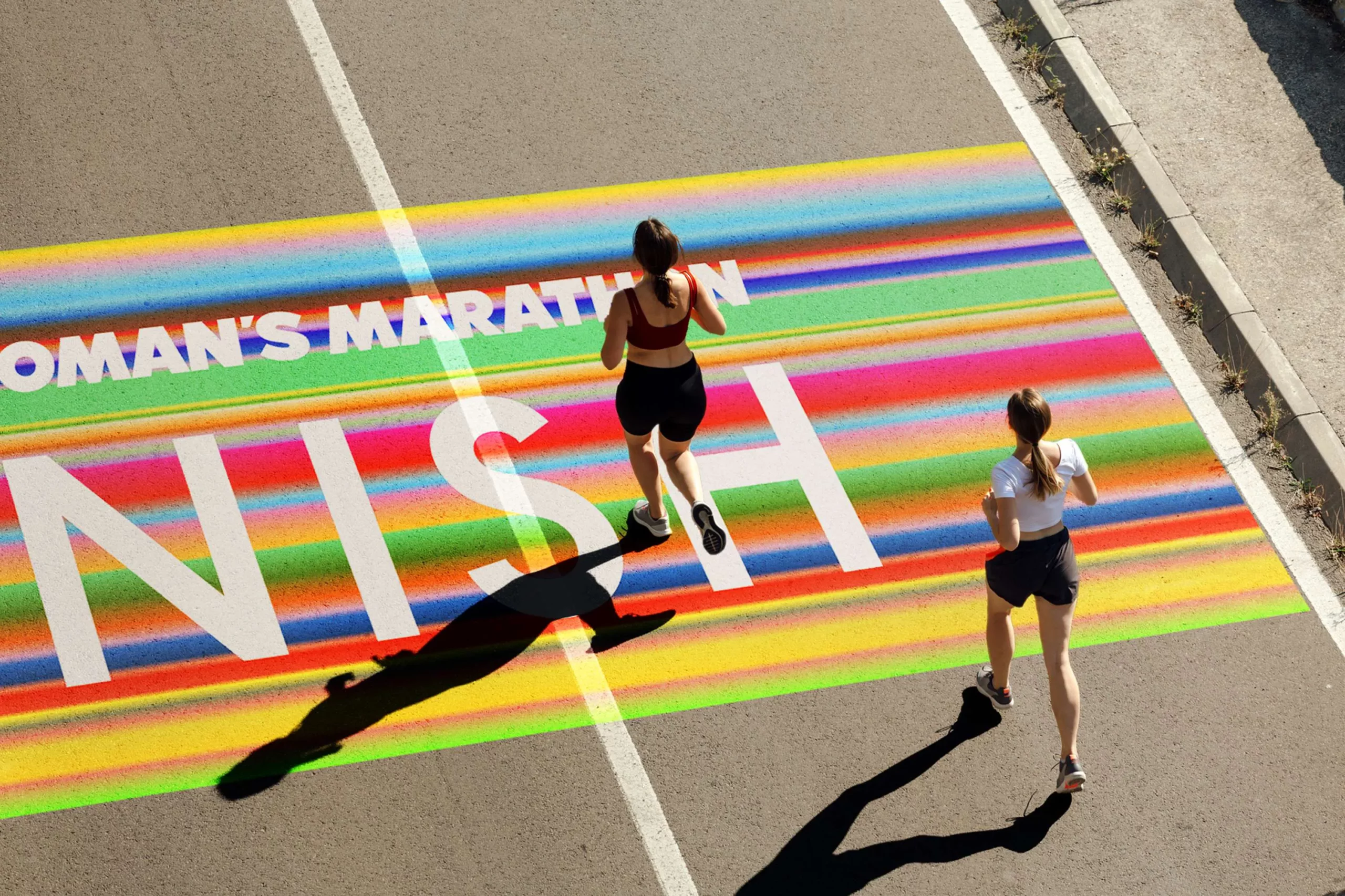
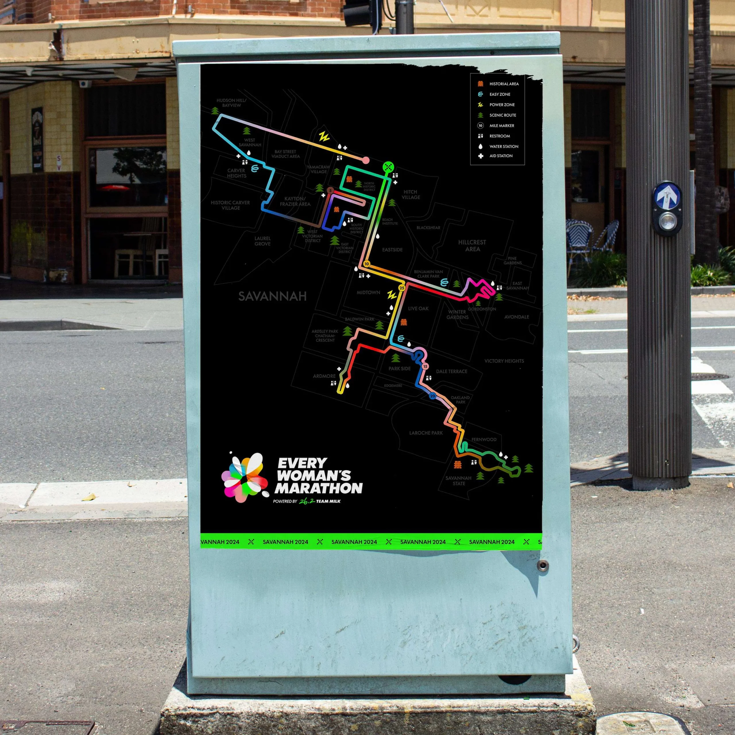
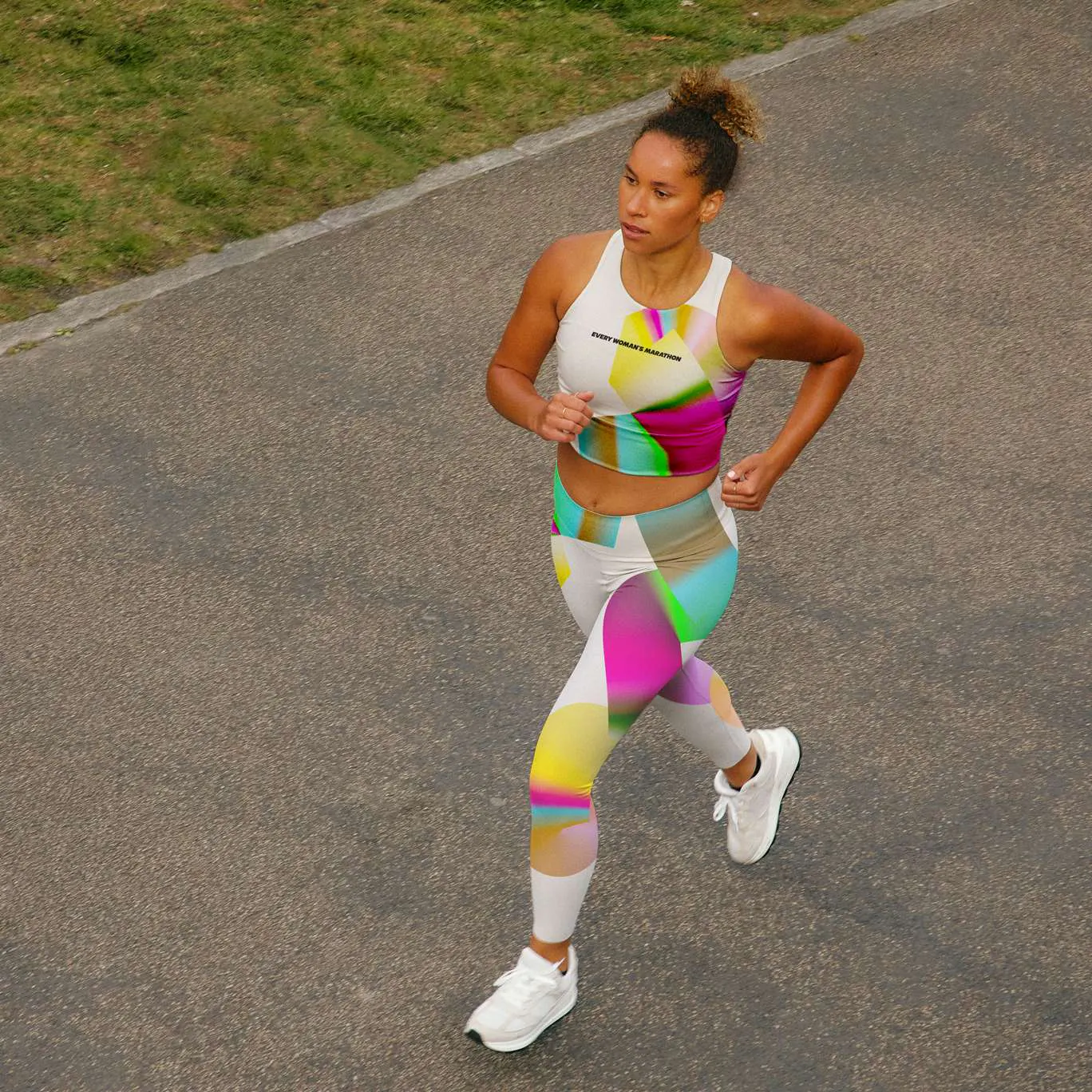
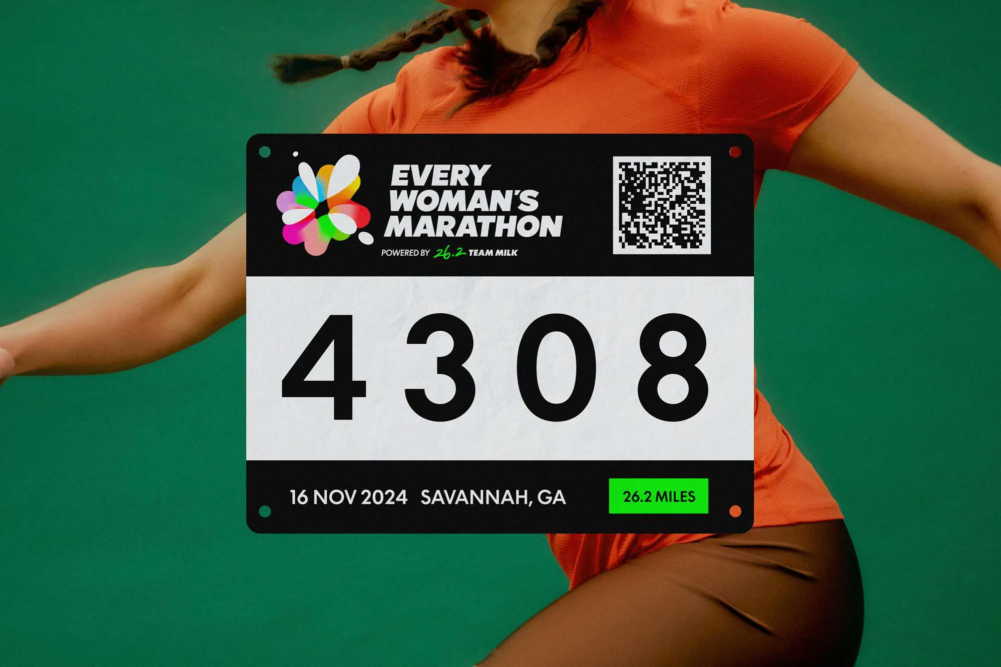
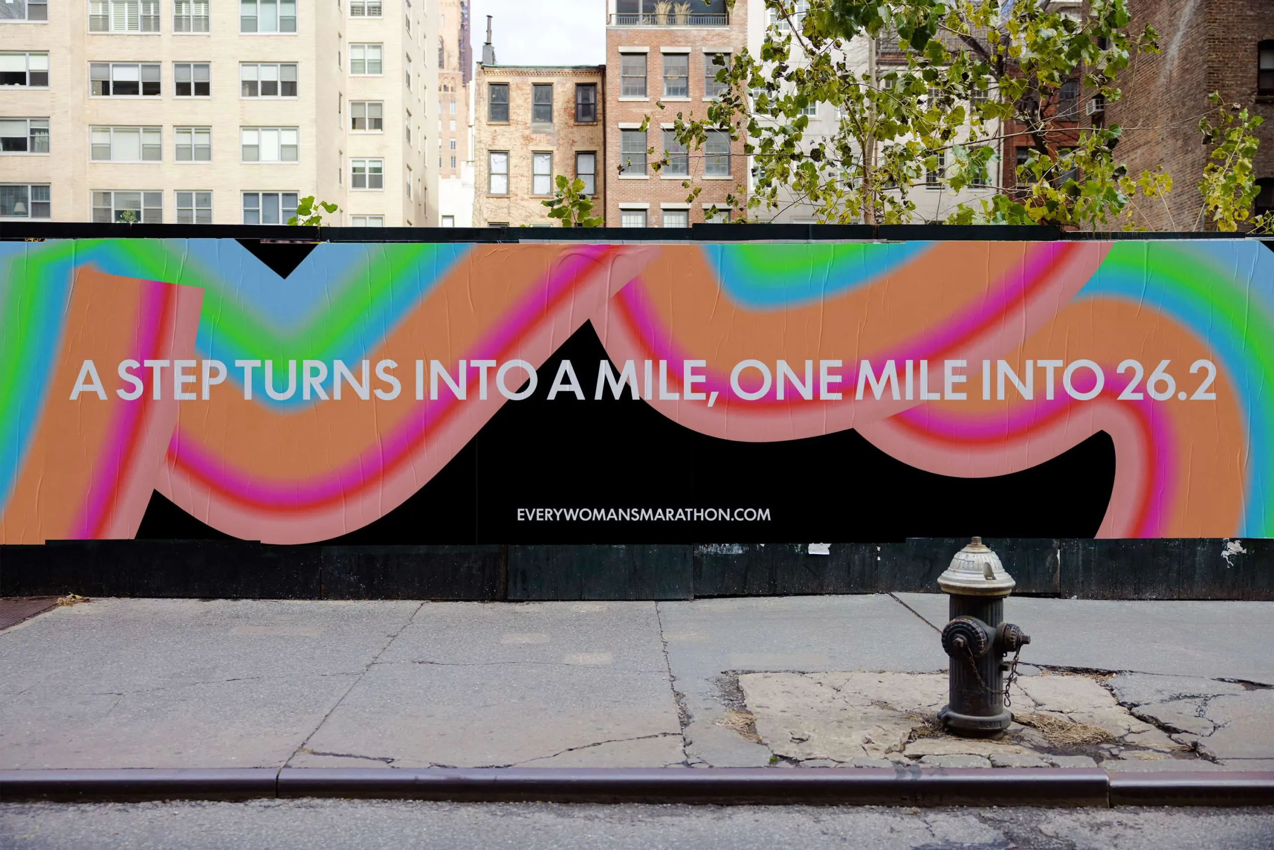
Every Woman's Marathon celebrates participation, not podium finishes. It's a race designed for women of all backgrounds and abilities to come together as a team. We built the brand identity around this core value of unity, with a bold, blocky logo symbolizing ambition and a slanted, stacked design that evokes a community flag. The colorful gradient emblem, co-created with sponsor Milk, represents the collective energy and celebration of women running together. Each color shade reflects the diversity of runners – The Moms, The Barefoot Runners, The Newbies, The Walkers – all united by the gradient's flow. Our graphic language uses shapes and paths to depict daunting distances as a series of achievable milestones, with blurred gradients mimicking the sensory experience of running through a city. The typeface, LL Supreme, complements Milk's existing branding with its strong, clear characters.
Studio: Yung Studio
Brand Identity
Graphic System
Animation
Photography Style
Brand and Motion Guidelines
Collateral Design
Disclaimer: All collateral designs are for proof of concept only. The final applications are still in the works.