Sunrise Healthcare
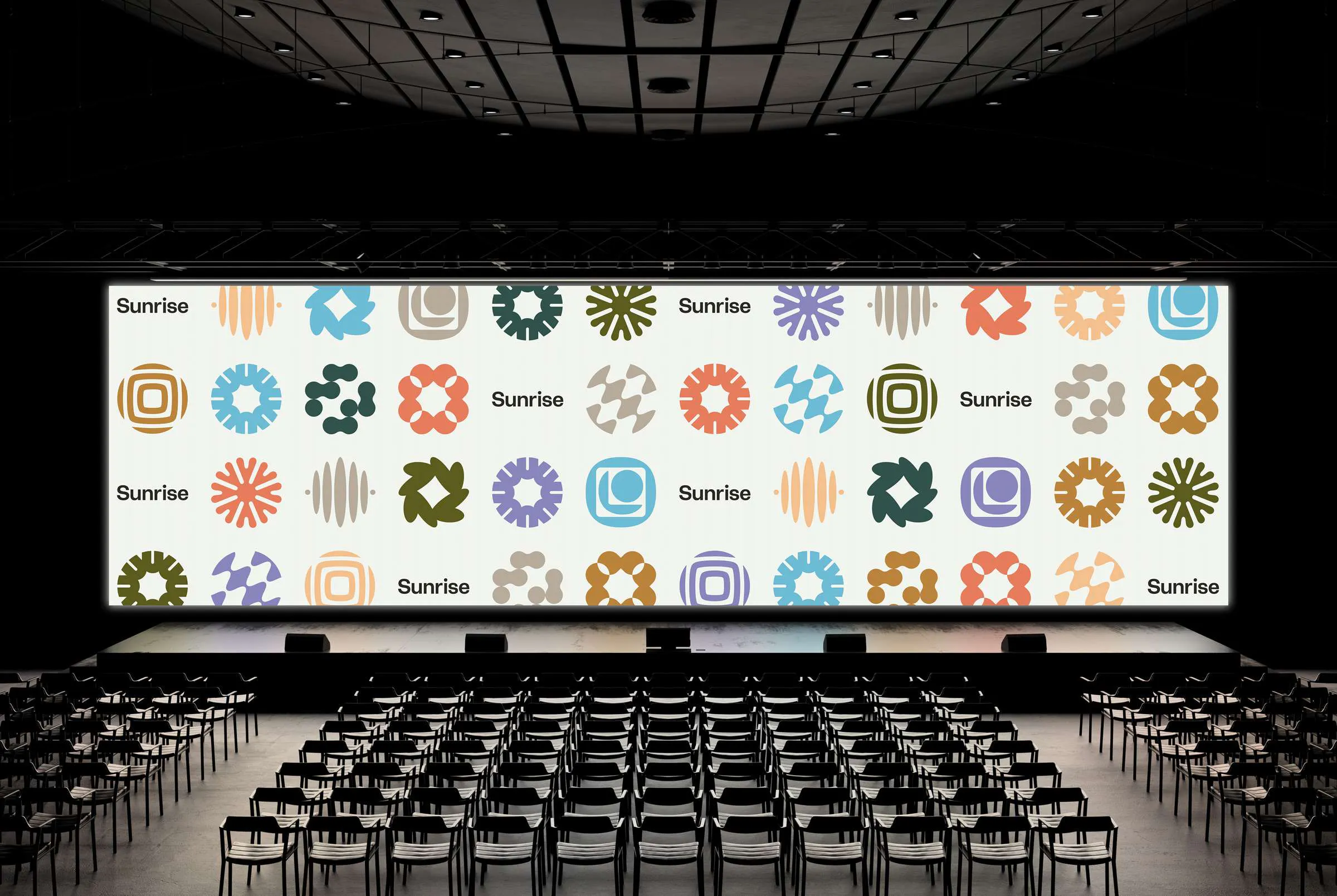
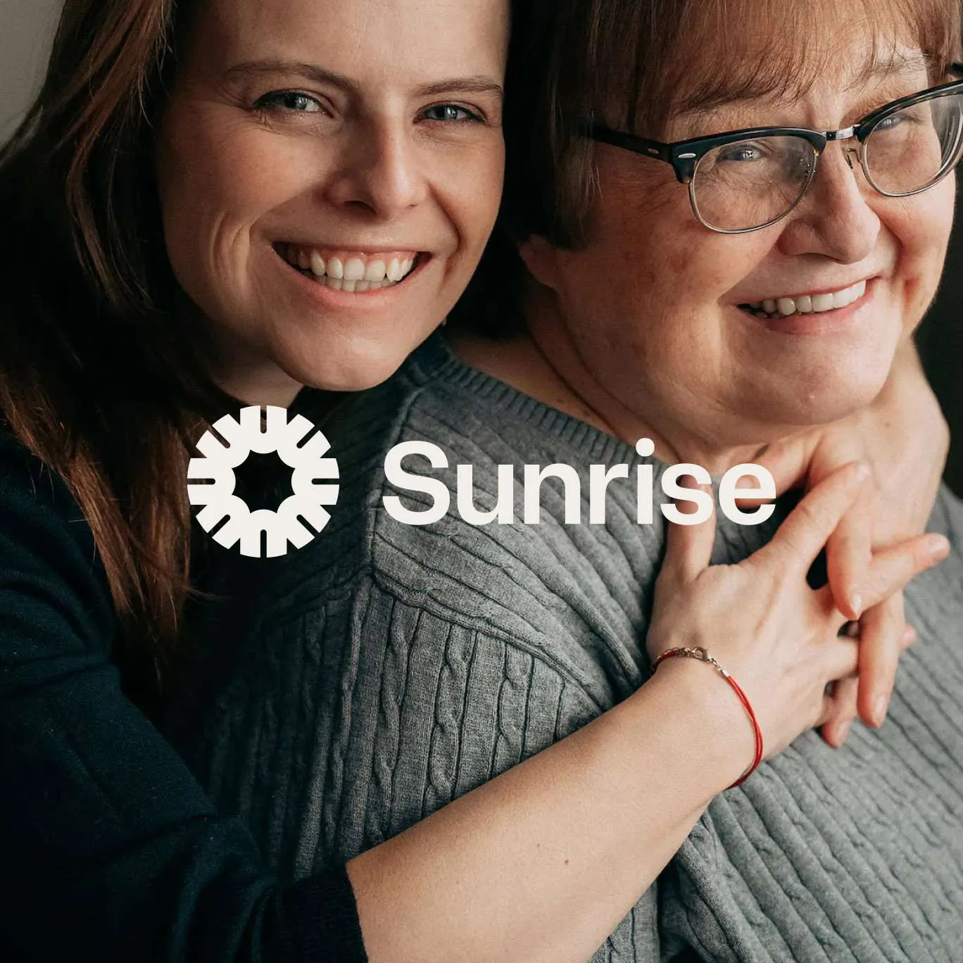
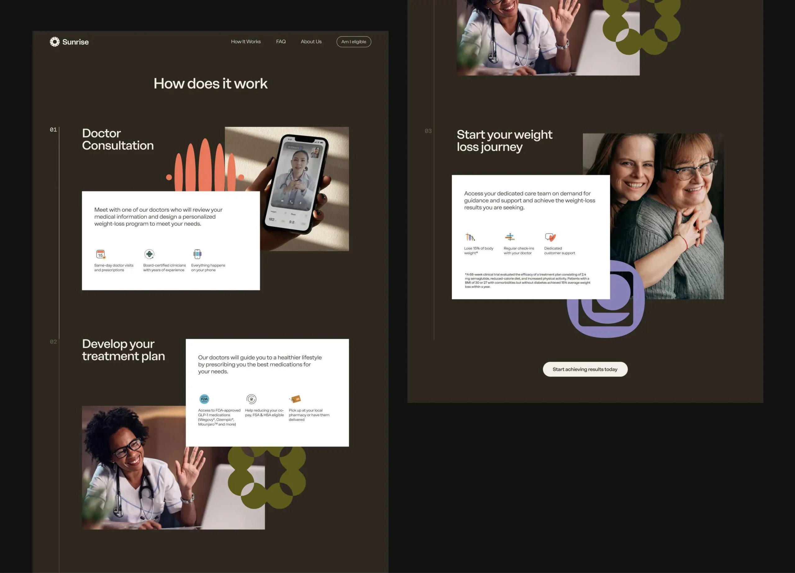
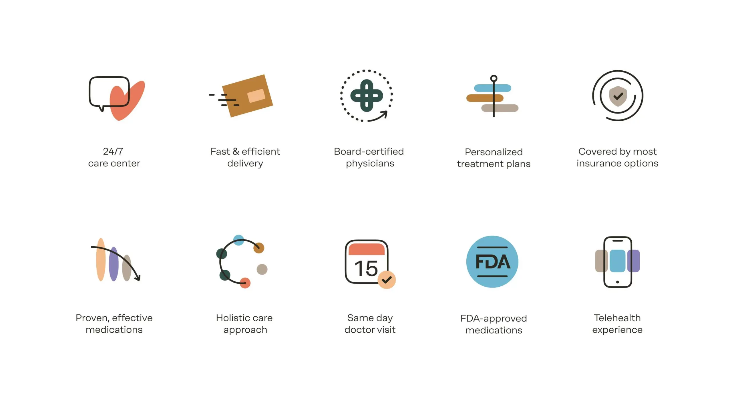
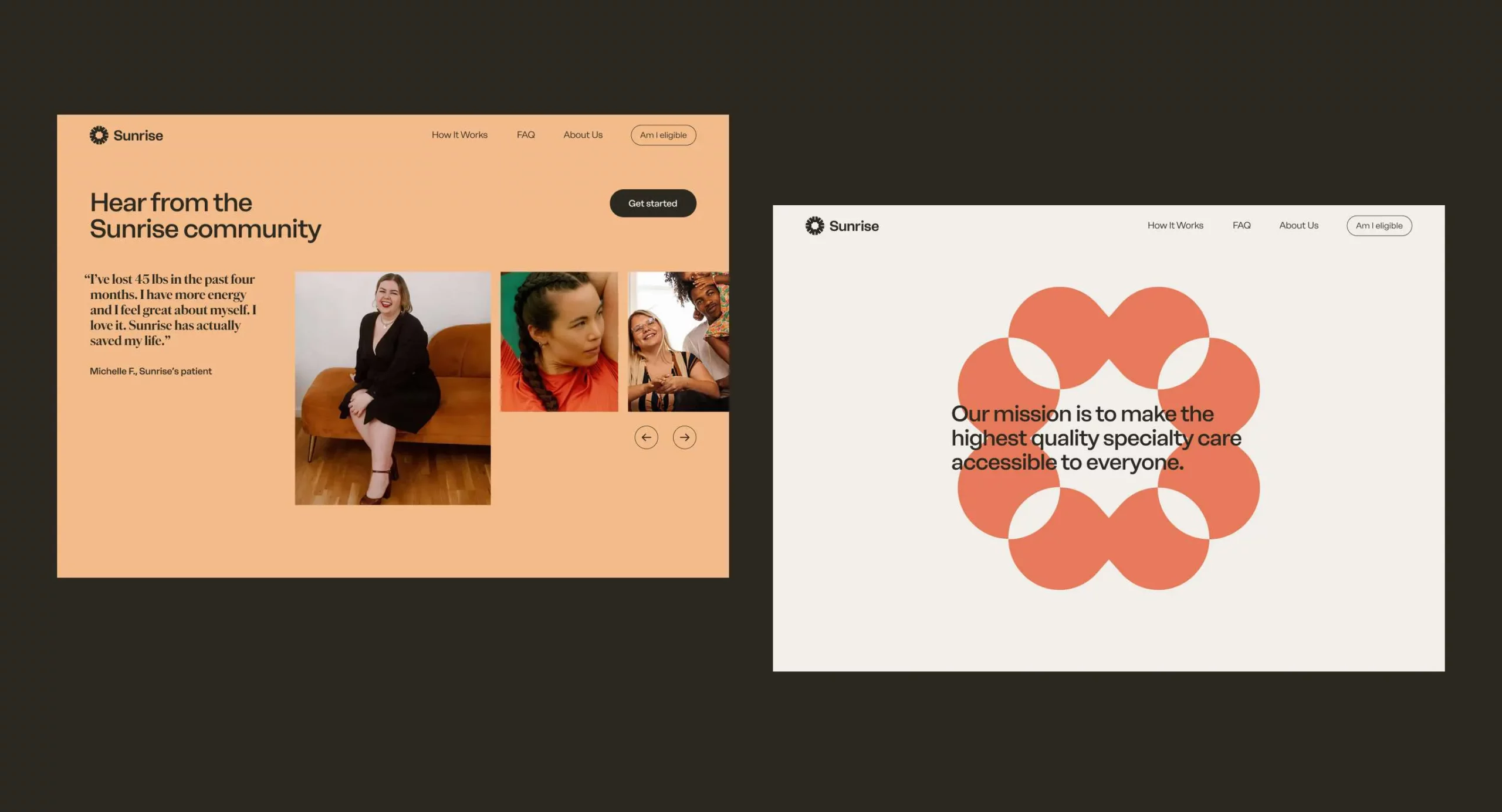
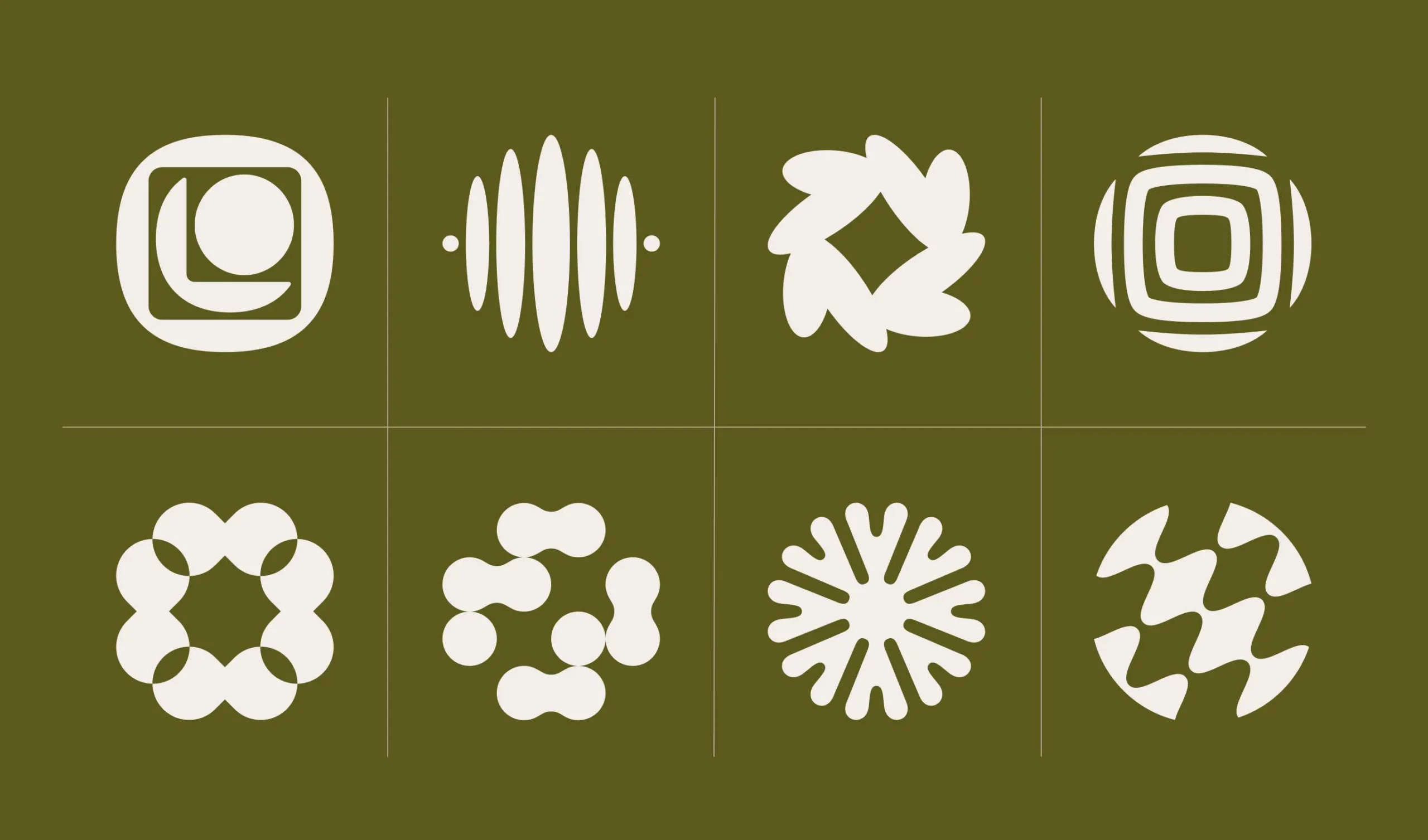
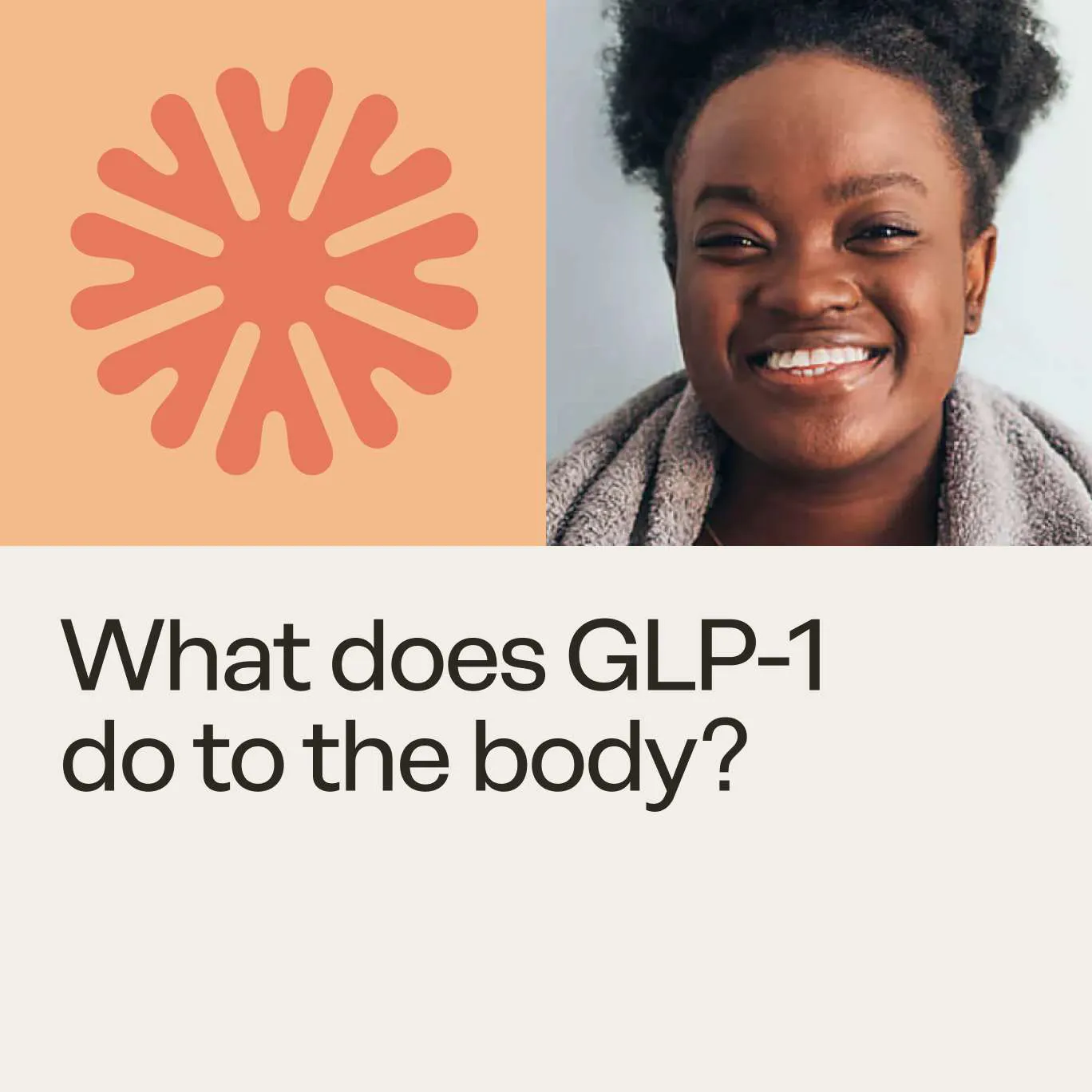
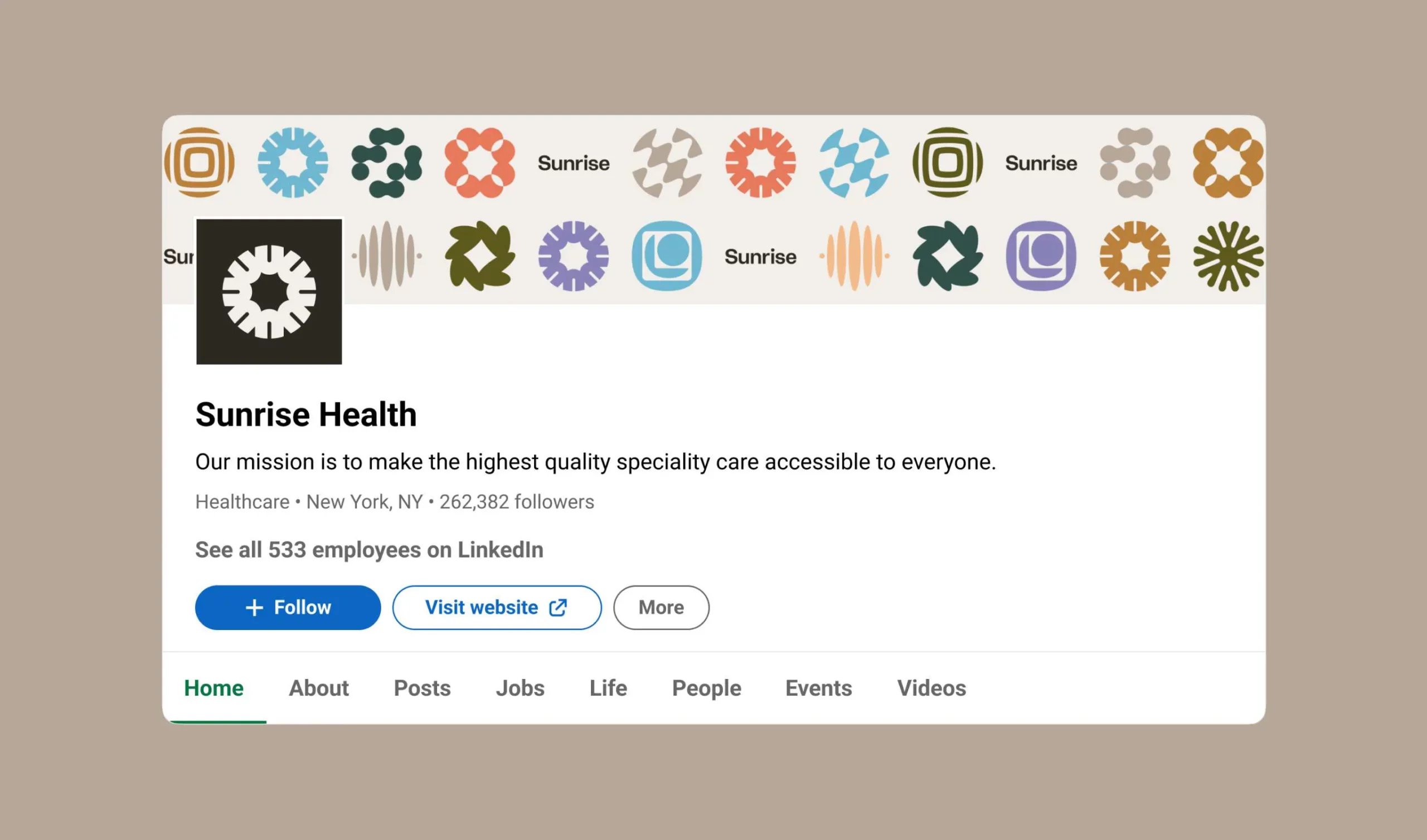
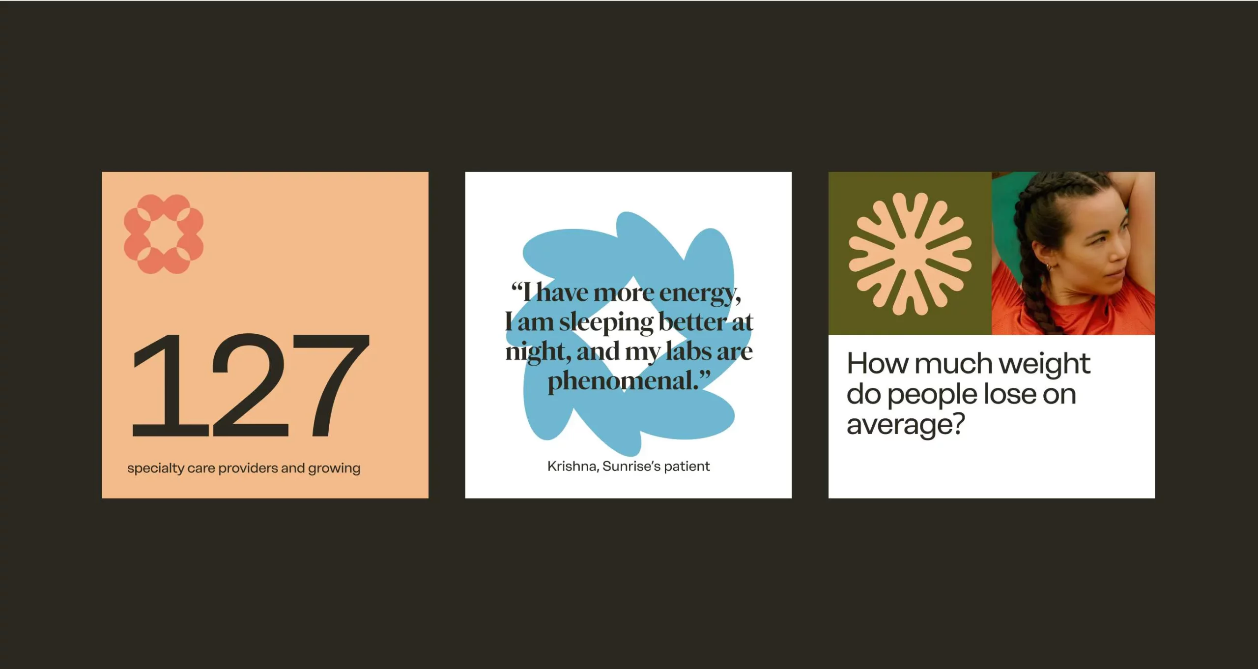
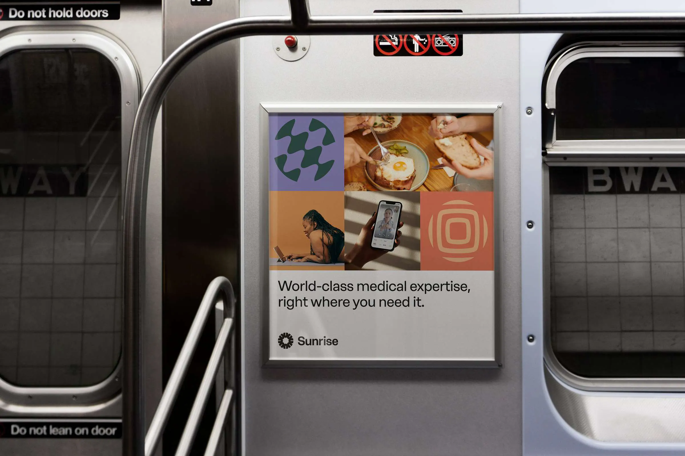
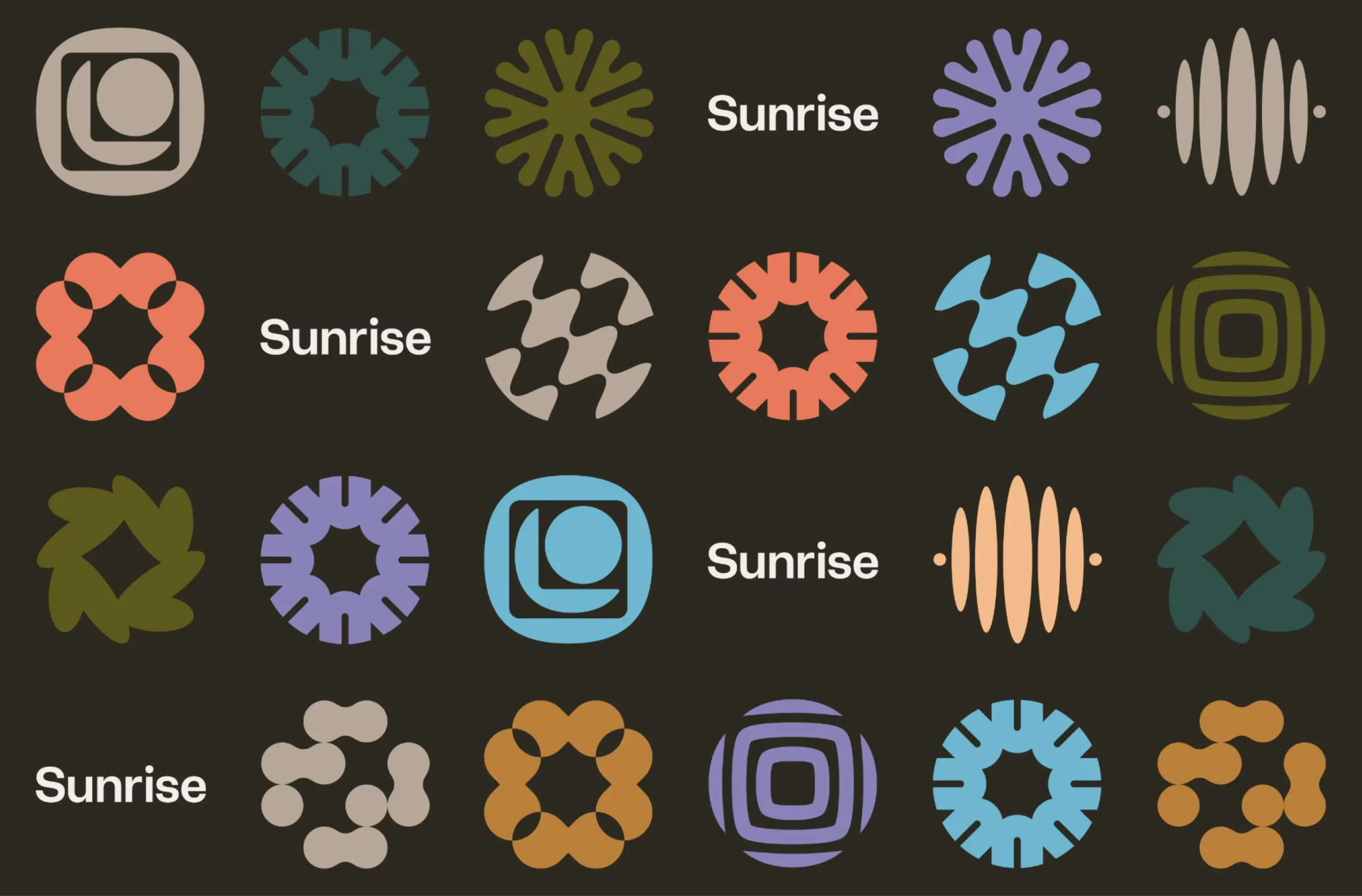
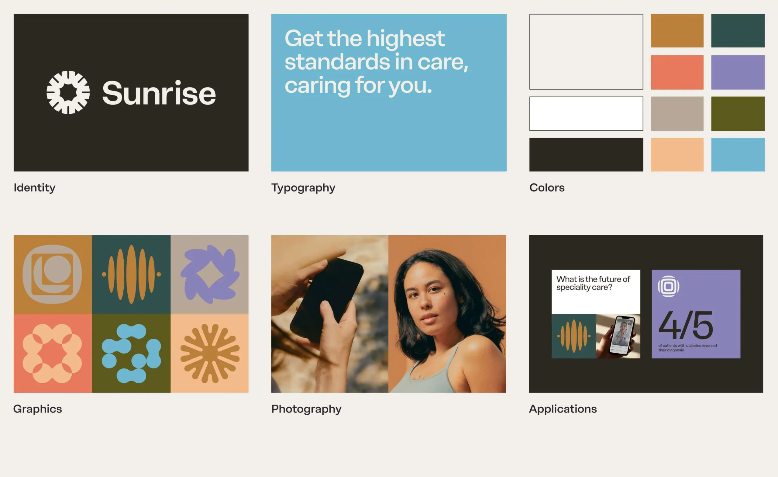
Sunrise, a healthcare provider, aims to democratize access to top-tier specialized care. We crafted a brand reflecting their patient-centric approach and commitment to innovation. The interlocking U emblem symbolizes a unified community empowered by collaboration. Geometric icons with an upward motion convey a sense of action, while mirrored symbols representing core values like patient focus and impactful care visually express support and harmony.
Studio: Yung Studio
Brand identity system
Website design
Social media templates
Design guidelines
findsunrise.com