Tapestry’s website as a window into the world’s largest machine
The Challenge The electric grid powers everything, and it’s aging. It costs $2.8 trillion a year just to maintain, leaving little room for the innovation it needs to keep up with modern demand. Tapestry, born at X, Alphabet’s moonshot factory, builds AI-powered tools that help the people who plan and run the grid. Its work is deeply technical, yet its website had to speak to everyone at once: utility partners who judge the technology, engineers and designers it hopes to hire, and journalists and a public who have never thought about how electricity reaches their homes.
The Opportunity Most people will never read a grid planning study, but anyone can follow a good story. So we designed the website around simple storytelling: show the future Tapestry is building first, then explain how it gets there, one idea at a time. Rich 3D illustrations, a dot-based motion system and animated moments turn abstract technology into something people can see, while clear value propositions give technical visitors the substance they need. The aim was one site that earns attention from the press, inspires future talent and builds trust with the industry.
One site for every kind of visitor. A utility planner, a journalist and a future engineer arrive with very different questions. We mapped a clear path for each, so the big picture always comes first and the technical depth is never more than one click away.

A homepage set in the future grid. We took the brand’s modern guideline elements and expanded them into a 3D isometric world, from charging stations to city blocks. Each scene shows a grid that runs seamlessly.
Motion designed with the developers. The brand’s dot grid comes alive as visitors scroll. A single dot acts like a spark of electricity, guiding people through the site from one section to the next. We prototyped every motion study alongside the developers from the start, so the site runs as smoothly on a phone as it does on a large screen.
Brand is the foundation. The website stands on a brand we built with Tapestry from the ground up. A voice and tone workshop shaped a human-centered narrative that honors the people who run the grid: bold, galvanizing and grounded in real impact. We refined the color palette, designed data visualizations and created the dot-based motion system, then carried it into investor and event presentations and a deck template the team can use on its own.
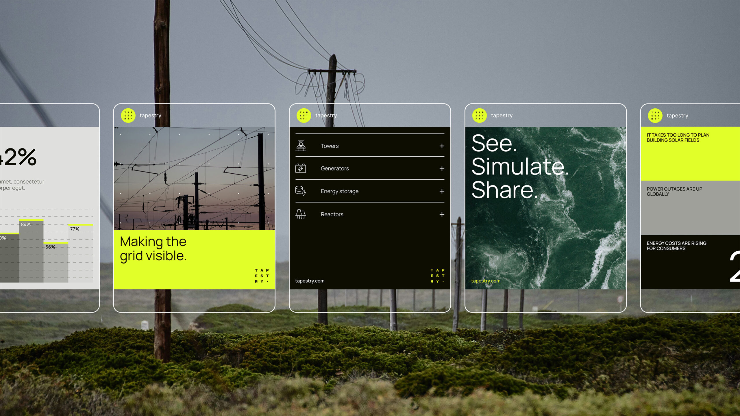
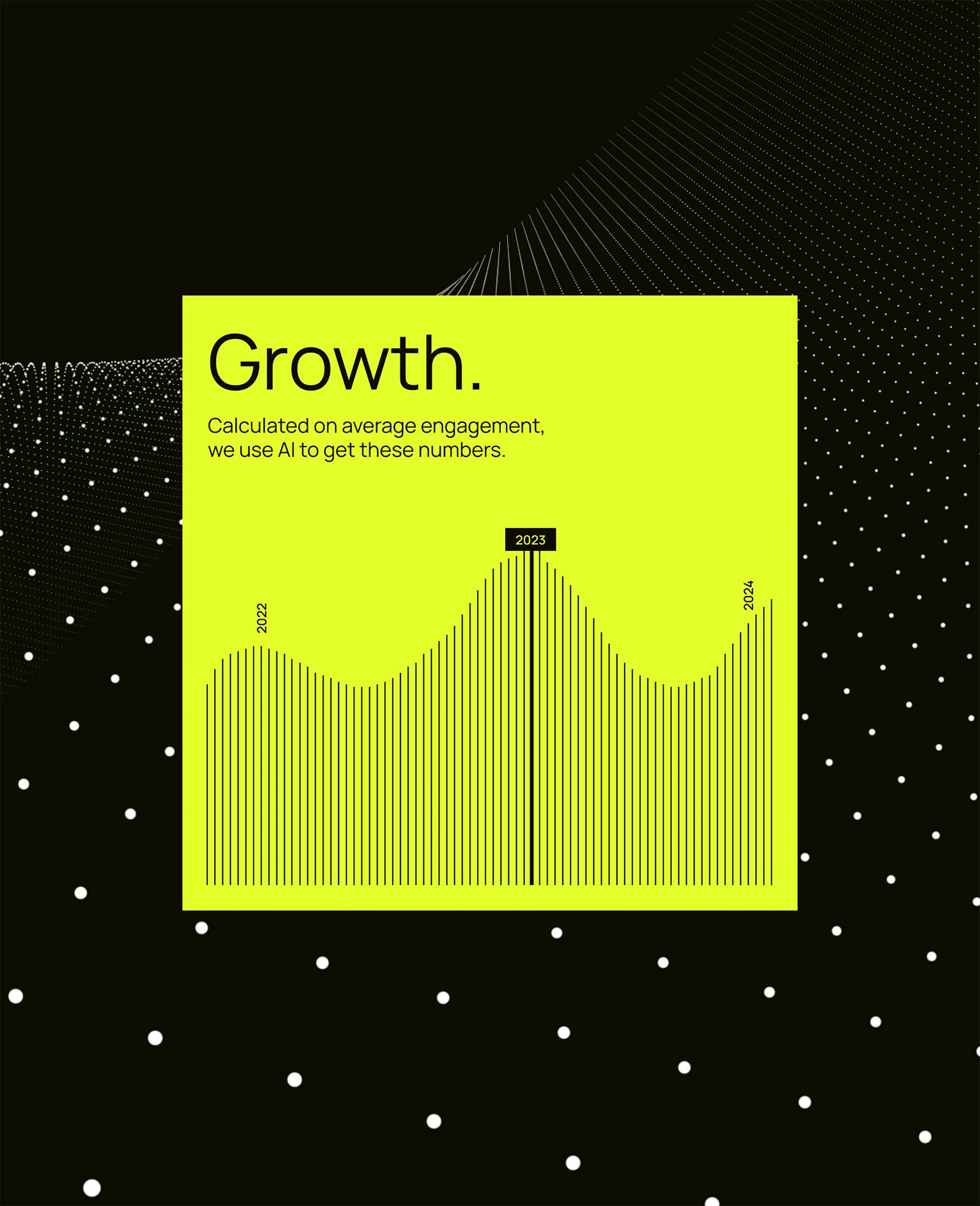
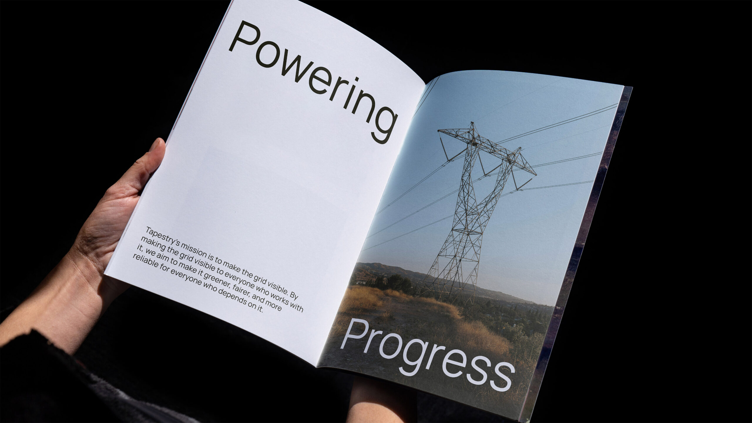
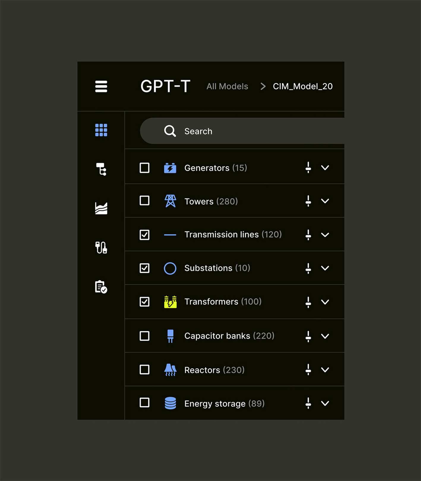
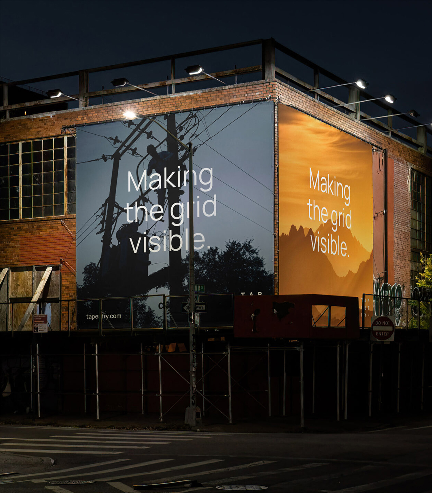
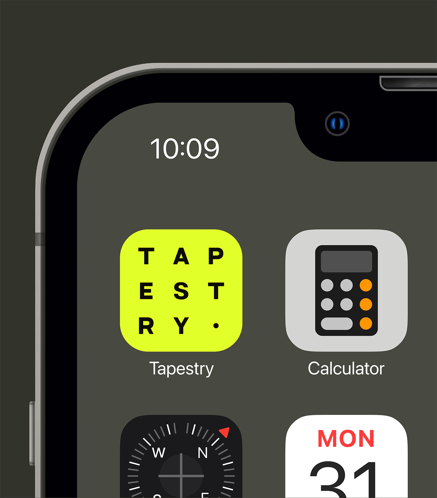
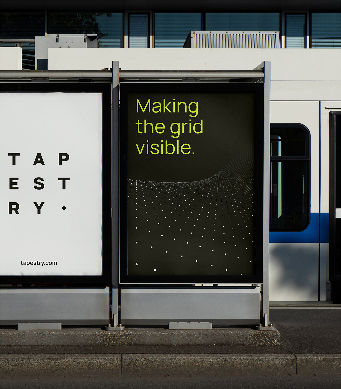
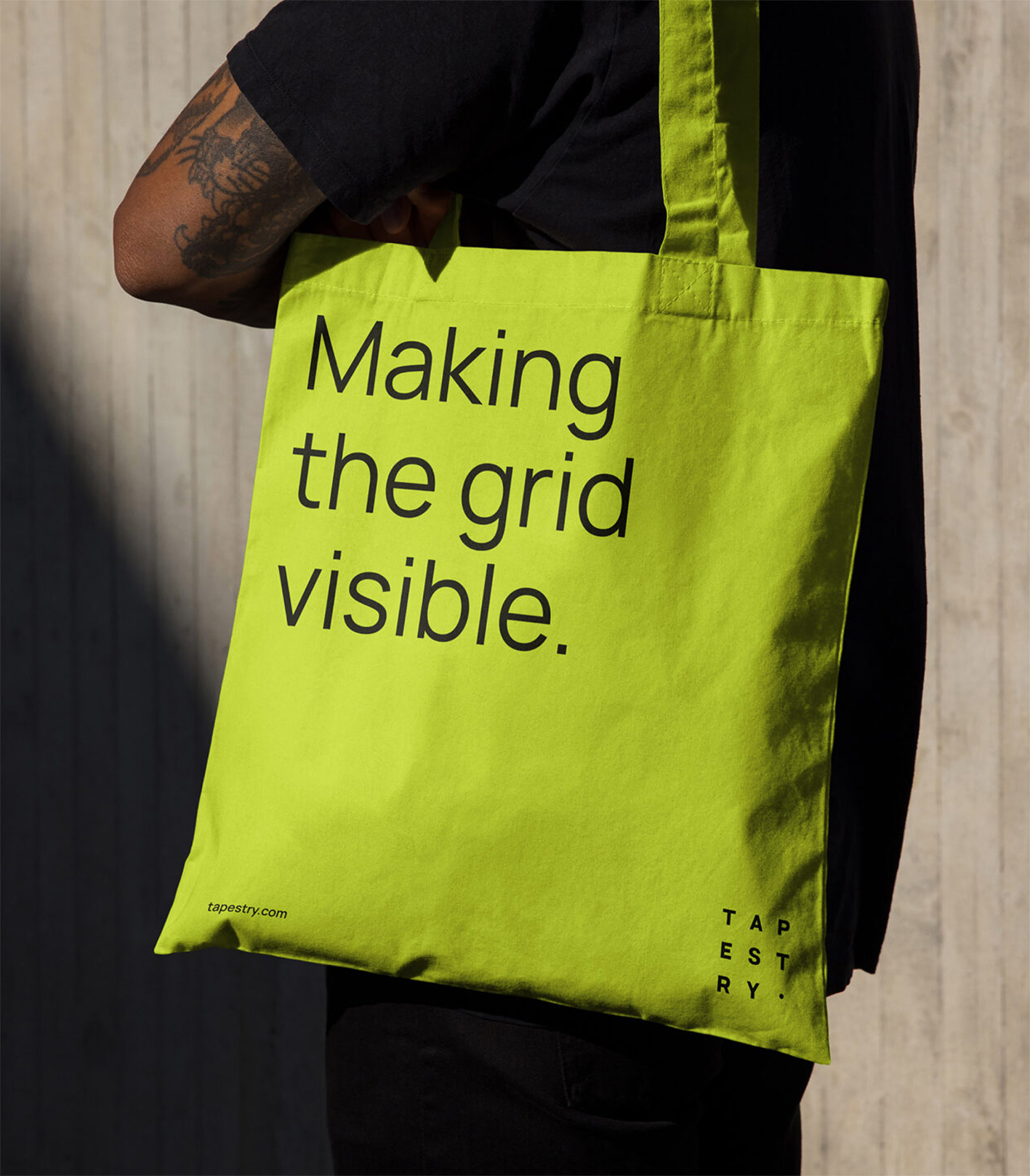
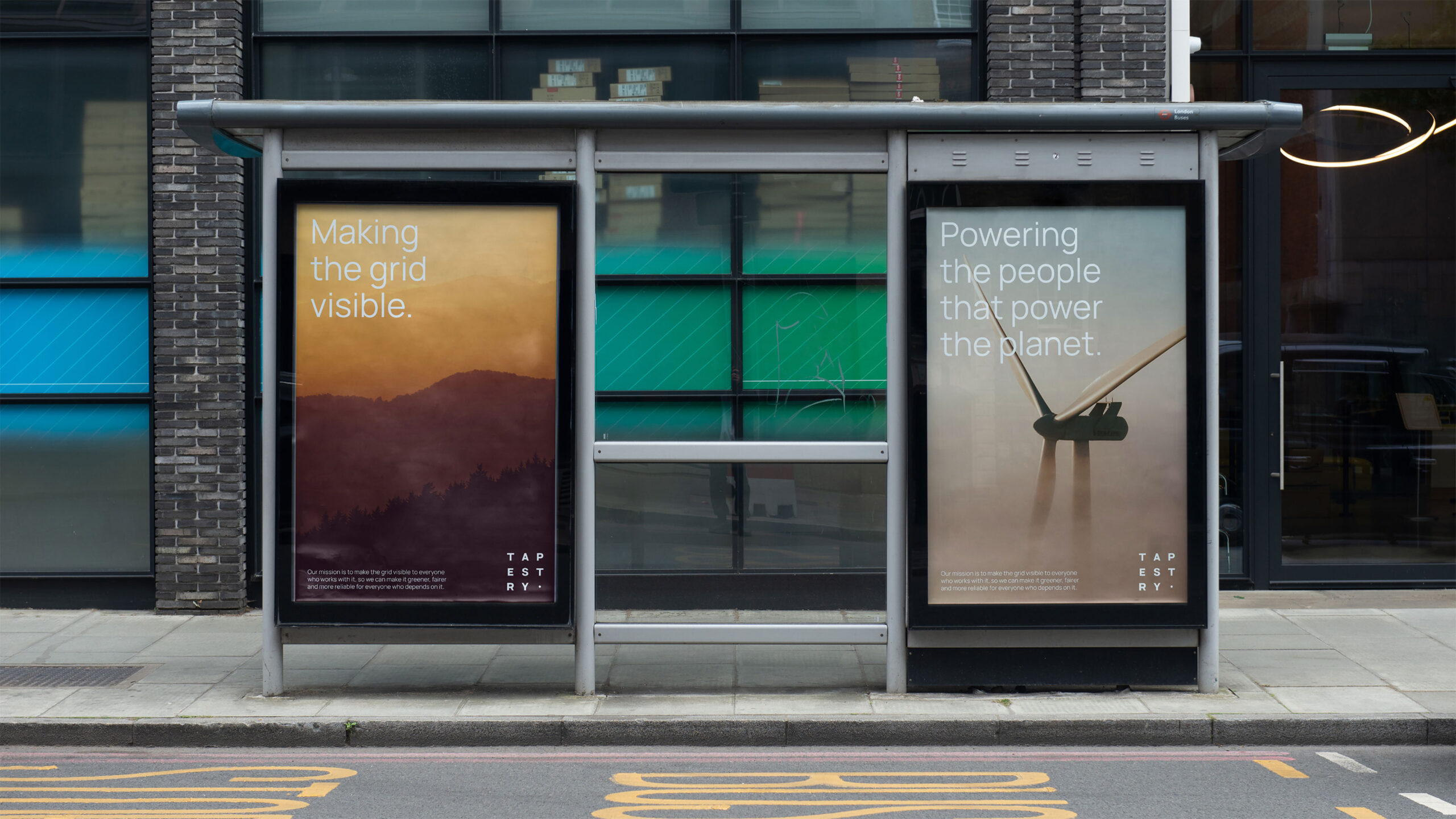
Making the grid visible everywhere. Tapestry’s brand system is flexible enough to live well beyond the screen. The same building blocks scale from a phone app icon to an event stage, a bus shelter poster or a tote bag, without losing what makes them recognizable.
The Outcome The website gave Tapestry a clear public home for a complex mission, one that grid operators, future hires, press and the public can all follow. As the work grows, the site gives each milestone a place to land, from Chile’s national grid operator to partnerships with PJM, which serves 67 million people, and Vector, New Zealand’s largest distribution utility. What started as a hard-to-explain technology now has a story people can see, share and believe in, and a foundation that’s ready to grow with the grid itself.
Scope
Web Design, UI/UX, Interaction Design, Motion Design, Art Direction, Brand Identity
Credit
Page Crahan, General Manager
Lauren Grillo, Marketing and Communications Lead
Team
Yu Rong, Web Design Lead
Kyle Macy, Brand Design Lead
Vero Maldonado, Copywriting
Salih Abdul-Karim, Video Production
Brian Wakabayashi, Brand Strategy
Leejay Abucayan, Presentation Design
Viso Haus, Development Studio
Sebastian Hemetsberger, Product Design
Hernan Osorio, 3D Artist
Michelle Ha, Project Management